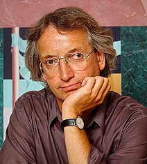
American architect and designer, Michael Graves was part of the “New York Five” group and is considered one of the fathers of postmodernism. Despite his building and home accessories standout designs being eccentric, he’d argue that “good design should be accessible to all”.

Image source:https://en.wikipedia.org/wiki/Michael_Graves#/media/File:Michael_Graves,_architect,_Princeton,_N.J.jpg
Master of the Postmodern
Graves was born in 1934 in Indianapolis. After high school, he went on to get his bachelor’s in drawing; after receiving his BA, he graduated from Harvard to obtain his masters’ degree in architecture. Graves also attended an art school in Rome to further foster his love of drawing, and as such drawing remained one of his favorite activities throughout his entire life. He founded and directed the Michael Graves Architecture & Design, with offices all the way to New York, and from 1964, he became professor emeritus at the University of Princeton. Considered one of the fathers of postmodernism in architecture, Graves was part of the New York Five with Richard Meier, Peter Eisenman, Charles Gwathmey and John Hejdukche, a group of architects who redefined the modernist movement in the 1970s. Opposing the formalism and minimalism in vogue at the time, the ‘five’ proposed a return to ornamentation, to colors, to the bizarre shapes. One example is the Portland Building in Oregon, perhaps the most famous and most controversial work, the Humana insurance skyscraper in Louisville and the Central Library in Denver.

Image source: https://en.wikipedia.org/wiki/Riverbend_Music_Center
Image source: https://spinalpedia.com/blog/2015/03/sci-superstar-michael-graves/
Graves’ Most Important Works
The Portland Building is considered one of the most famous works of post-modern architecture. It is characterized by symbolic elements on its facades, which are in contrast to the functional modernist architecture of that time. In 1979, in Portland (USA) a competition was launched for designing the Portland Service Building. Graves participated in this competition, distinguishing himself from his challengers who used expensive materials such as glass and concrete. Indeed, he preferred to rely on a colorful low-cost design, that was the key to his victory. One of the building’s goals is to create a continuous connection between past and present. As Graves explains, it is
[…] a symbolic gesture, an attempt to re-establish a language of architecture and values that are not part of the modernist homogeneity.
This building has four white regular facades with the addition of pillars and key stones. From the outset, the building has been the subject of criticism because both the tapes and the medallions were not considered to be such a level as to characterize an official government building. Other people have instead criticized the excessive presence of symbolism and references to the past. A more serious and reasonable criticism regards the absence of functional elements such as the arches that flank the facades that are difficult to access.

Image source: https://search.creativecommons.org/photos/fc39ba58-b0f7-4e46-b579-59c19e7d6a6b by Chris Harley
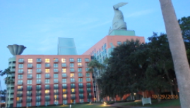
The Walt Disney World’s Dolphin and Swan Resort Hotel were built in the late 1980s. For this project, Graves and his collaborators took into consideration both the architecture of the past, the landscape and the climate of Orlando to create buildings that would stand out from those already present in the city. Indeed, these buildings were characterized by brightly colored, boldly geometric volumes and animal-shaped pediments. This project consists of two buildings: the largest Dolphin hotel is anchored by a giant triangular element in the center, and then there is the Swan hotel. Both hotels are characterized by exteriors with large-scale motifs such as banana leaves covering the dolphin and abstract waves near the swan. The presence of ornamental animals placed on the roofs of the building immediately catches the eye. Indeed, they are used as recognizable and distinguishable elements. Both hotels cover a square area that exceeds two million square feet sitting opposite each other on either side of a lake. However, they are connected by a causeway across the waterside,
which was renamed the “Michael Graves Causeway” when the American architect died.

Image source: https://search.creativecommons.org/photos/3ac421ad-9bc7-42dd-8344-7e54378bf060 by osseous
“My Favorite Project Is Always The Next One”

Image source: https://commons.wikimedia.org/wiki/File:2016-0515-CedarGablesHouse-by-MichaelGraves.jpg
Borrowing heavily from the past, Graves often combined traditional details with whimsical flourishes with provocative and innovative postmodernist designs. He brought color and playfulness to tall while at the same time designing everyday objects such as teakettles and kitchen trashcans for ordinary consumers. Graves was a great architect who was able to be intimate and monumental, iconoclastic and reverential, challenging and coddling often all in the same building. He was a very hard worker sophisticated in art, literature and history, but he always brought these interests back into everyday life, designing home furniture, teapots, and other household items. His teapot remains one of his favorite designs. He moved from an abstract and ornate modernism to a deceptive landscape embrace of traditional pre-modern planning strategies. Graves has repeatedly stressed that the goal of his profession was to “delight the soul through the buildings” and thanks to any element that compose them, external and internal, from windows to toilets.
“Good design should be accessible to all”, he argued.

Image source: https://search.creativecommons.org/photos/cad65480-6ffc-4d99-ad79-da8b6894cb7b by Didriks
Info sources:
https://www.archdaily.com/407522/ad-classics-the-portland-building-michael-graves
