Ludwig Mies van der Rohe designed the pavilion on behalf of the German Government for the 1929 World Exhibition in Barcelona. It was made in collaboration with Lilly Reich, who was the creative director of the German buildings.
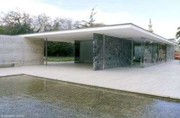
Image source: https://search.creativecommons.org/photos/5f893424-32cd-4f1c-830c-ddc7f19423d3 by Sandro Maggi Architetto
Free Floor Plan
On an especially selected parcel of land, Mies fulfilled a vaguely formulated architectural assignment, by constructing a flat-roofed representational building with a “free floor plan,” that is, a series of flexible spaces with flowing transitions from one room to the next. The finest materials used, such as onyx doré, green marble and travertine, combined with large glass façades that “floated” in a steel skeleton construction, gave the pavilion its characteristic transparency and spaciousness.
The absence of traditional national emotive themes contributed substantially to the pavilion’s positive impact and increased the building’s acceptance among the visitors and hosts of the World Exhibition. Even decades after it was torn down, the significance of the once ephemeral structure is undisputable.
The Project Commissioned
Mies was offted commission for the building, in 1928, after his successful administration of the 1927 Werkbund Stuttgart exhibition. The German Republic entrusted Mies with the artistic management and creation of not only the Barcelona Pavilion, but all German buildings at the 1929 International Exhibition. However, Mies ran into severe time constraints, as he had to design the Barcelona Pavilion in less than a year, while also managing unstable finances.
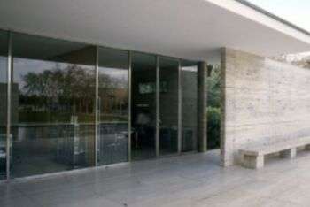
Image source: https://search.creativecommons.org/photos/ab4e8ef4-06e9-4212-b503-a773989e1d6c
In the years following World War I, thanks to the economic recovery started by the 1924 Dawes Plan, Germany entered a new phase. The pavilion for the International Exhibition represented the new Weimar Germany: democratic, culturally progressive, prospering, and thoroughly pacifist. It served as an architectural self-portrait.
This concept was carried out with the realization of the “Free plan” and the “Floating roof” key elements.
The Building
The Barcelona pavilion’s design is based on a formulaic grid system developed by Mies, serving not only as the pattern for the travertine pavers, but also as an underlying framework for the wall systems to work within. By raising the pavilion on a plinth, in conjunction with the narrow profile of the site, the Barcelona Pavilion has a low horizontal orientation that is accentuated by the low flat roof. Further, it appears as the building is floating over both the interior and the exterior.
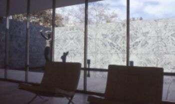
Image source: https://search.creativecommons.org/photos/9a67e3e1-0334-482b-9b9e-0375940450c4 by Sandro Maggi Architetto
The low stature of the building narrows the visitor’s line of sight and forces one to adjust to the vision framed by Mies. The interior of the pavilion consists of offset walls that work with the low roof plane to encourage movement, as well as activate Mies’ architectural promenade. Additionally, these framed views induce movement through the narrow passage that open into a larger volume. The cyclical process of moving throughout the pavilion set in motion a process of discovery and rediscovery during one’s experience, which always offer a new perspective previously unseen.
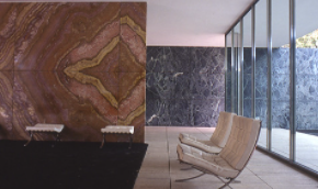
Image source: https://search.creativecommons.org/photos/30f9ca49-e83e-47a5-8740-401b6627a428 by Sandro Maggi Architetto
One of the most important aspects of the pavilion is the roof. Its low profile appears in elevation as a floating plane above the interior volume: the appearance of floating gives the volume a sense of weightlessness that fluctuates between enclosure and canopy. The roof structure is supported by eight slender cruciform columns that look as if it is effortlessly floating above the volume, while freeing up the interior to allow for an open plan. With the low roof projecting out over the exterior and the openness of the pavilion, there is a blurred spatial demarcation, where the interior becomes exterior and exterior becomes interior.
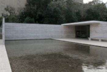
Image source: https://search.creativecommons.org/photos/5e57131a-01dd-425e-8231-8eae57bb85a8 by Sandro Maggi Architetto
The pavilion is proportional, and the interior of the pavilion juxtapose two reflecting pools. The smaller pool is located directly behind the interior space. This allows for light to filter through the interior volume as well illuminate the marble and travertine pavers.
A Modernist Classic
For more than half a century, the “Barcelona Pavilion” colored the imagination of modern architects worldwide. It was enticing, beautiful, and yet it stood for no more than a few months before demolition. Even so, this was enough to inspire imperfect lookalike designs over several decades.
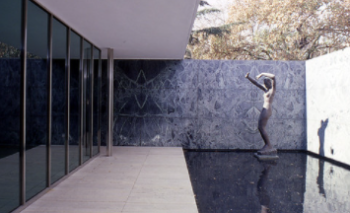
Image source: https://search.creativecommons.org/photos/bd0339c2-7223-42c2-853f-d991da0dd3ea by Sandro Maggi Architetto
Commissioned by the Weimar Republic, the structure advertised a new, progressive, democratic and modern Germany. The vision for the future was no starkly functional “machine for living.” It was a manifesto for the rising glory of a new nation, from the ashes of its darkest hour. Thus, rich materials, such as tinted glass, marble, onyx, chromed steel and travertine, make up the German Pavilion. Walking through the pavilion, reflections of sun-dappled water play on the ceiling, and wind wafts through the open plan. Thus, itis hard to tell the interior from exterior. Further, the structure had to be built quickly, due to the exhibition. However, the quality of the materials used made the German Pavilion look long-lasting.
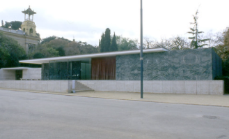
Image source: https://search.creativecommons.org/photos/76f4de4a-19fb-48c8-ab98-7cbd9df27d7c
This dreamlike atmosphere reinforced by simplistic decoration, has a single single sculpture of a nude female. German artist George Kolbe created the structure, titled Alba or Dawn. Additionally, the architect’s new leather and chrome steel Barcelona chairs are also present. While other nations depicted their heritage through eclectic displays, Germany chose to represent itself through this minimalist building.
Reconstruction
The Barcelona Pavilion, an emblematic work of the Modern Movement, has been exhaustively studied, interpreted, and inspired the oeuvre of several generations of architects. After the closure of the Exhibition, the Pavilion was disassembled in 1930. As time went by, it became a key point of reference to Mies van der Rohe’s own career and twentieth-century architecture.
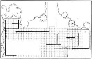
Image source: http://louisfeedsdc.com/19-simple-pavilion-plan-ideas-photo/barcelona-pavilion-plan/
In 1980, head of the Urban Planning Department at the Barcelona City Council Oriol Bohigas set the project in motion. He commissioned architects Ignasi de Solà-Morales, Cristian Cirici and Fernando Ramos to research, design and supervise the pavilion reconstruction. Work began in 1983, and the new building opened in 1986.
Glass, steel and four different kinds of stone including Roman travertine, green Alpine marble, ancient green marble from Greece and golden onyx from the Atlas Mountains, completed the reconstruction, mirroring the same characteristics and origin of the originals employed by Mies, in 1929.
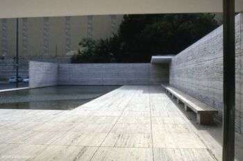
Image source: https://search.creativecommons.org/photos/f65ca223-37f8-41b7-832e-e32a053e0627 by Sandro Maggi Architetto
Since the Pavilion’s reconstruction in the 1980s, the Mies van der Rohe Foundation has invited leading artists and architects to temporarily alter the structure. These installations and alterations, called “interventions,” have kept the pavilion at the center of debate on architectural ideas and practices.
Info source:
http://miesbcn.com/the-pavilion/
https://www.bauhaus100.de/en/past/works/architecture/barcelona-pavillon/
https://en.wikipedia.org/wiki/Barcelona_Pavilion
https://www.archdaily.com/109135/ad-classics-barcelona-pavilion-mies-van-der-rohe
http://www.bbc.com/culture/story/20130924-less-is-more-a-design-classic
