Toyo Ito is a Japanese architect known for creating conceptual architecture in which he seeks to simultaneously express the physical and virtual worlds.
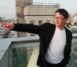
Image source:https://search.creativecommons.org/photos/f31d3522-676e-4ff1-ad77-0c4f551af6fa by 準建築人手札網站 Forgemind ArchiMedia
Toyo Ito’slife
Ito was born in Japanese-occupied Korea to Japanese parents. He went to Japan with his mother and sisters in 1943, and his father moved back there a few years later. Ito studied architecture at the University of Tokyo. After graduating (1965), he apprenticed with Kikutake Kiyonori, one of the leaders of the Metabolist school, a Japanese architectural movement of the 1960s that advocated a radically futuristic approach to design. As the Metabolist movement wound down, Ito left Kikutake’s firm, and in 1971 he established his own practice, Urban Robot (URBOT), in Tokyo, initially focusing on residential and other small-scale projects.

Image source: https://search.creativecommons.org/photos/19e4a2e8-e80b-4260-b6bf-fb928d8b5c5f
Info source: https://www.britannica.com/biography/Toyo-Ito
What is Toyo Ito’s vision?
It is often said that Ito’s work has affinity with the ideas of philosophers such as Munesuke Mita and Gilles Deleuze. Ito defined architecture as “clothing” for city dwellers, especially in the contemporary Japanese metropolis. This theme revolves around the balance between private life and the “public” metropolitan life of an individual. The current architecture of Toyo Ito expands his work produced during the postmodern period, aggressively exploring the potentials of new forms. In doing so, he tries to find new spatial conditions that manifest the philosophy of beings without frontiers.
Info source: https://en.wikipedia.org/wiki/Toyo_Ito
Awards
He has received numerous international awards, including in 2010, the 22nd Praemium Imperiale in Honor of Prince Takamatsu; in 2006, The Royal Institute of British Architects’ Royal Gold Medal; and in 2002, the Golden Lion for Lifetime Achievement for the 8th Venice Biennale International Exhibition.
Info source: https://www.metalocus.es/en/news/bio-toyo-ito-2013-pritzker-architecture-prize
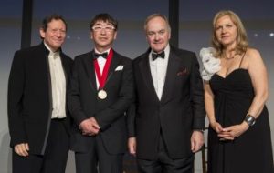
Image source: https://www.archdaily.com/380366/2013-pritzker-prize-ceremony-toyo-ito
What are the most important works of Toyo Ito?
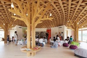
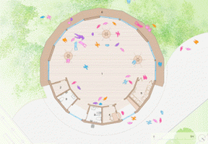
- ‘Minna no Mori’ Gifu Media Cosmos, Gifu, Japan (2015)
Circular in plan, the building features a curving wooden lattice roof, designed to resemble a “large straw sun hat“.
Info and images source: https://www.dezeen.com/2016/03/11/klein-dytham-architecture-soma-city-home-for-all-community-hall-tohoku-earthquake-tsunami-relief/
- Museum of Architecture, Imabari, Japan (2011)
A tandem of the architectural projects. Steel Hut is a hybrid of the tetrahedron, octahedron, and other geometrical figures. The combination of transparent and perforated screens represents the intrinsic lightness of the Japanese architecture, but is subjective in interpretation.
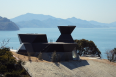
Image source: https://search.creativecommons.org/photos/aef242b6-3ba4-4822-827d-1f83465b3465
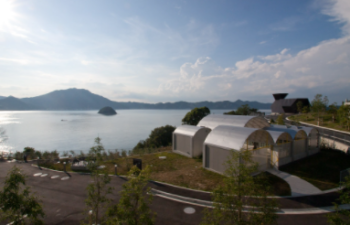
Image source: https://search.creativecommons.org/photos/db3c5af8-f82b-476e-901f-25dd6cbc1f61 by kentamabuchi
Info source: https://mahno.com.ua/en/blog/post/toyoito
- Torres Porta Fira, Barcelona, Spain (2010)
The two buildings are linked by a common atrium. The hotel is contained in a distorted cylinder, expanding towards the top and clad in red metal panels.The office building is a rectangular volume with a glass curtain wall and red motif running through the centre.
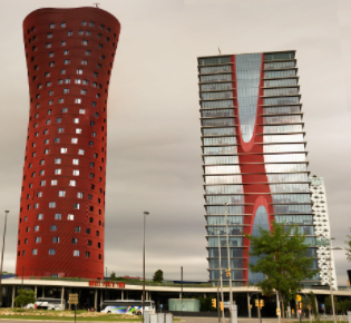
Image source: https://search.creativecommons.org/photos/db538b44-3c80-4153-beaf-e2f8752655a0 by Maximilian Goldmann
Info source: https://www.dezeen.com/2010/03/03/porta-fira-towers-by-toyo-ito-and-b720-arquitectos/
- Tama Art University Library, Tokyo, Japan (2007)
This is the place to read, engage in discussions, relax or just have a cup of coffee. The particular feature of the ground floor is that has no walls. 166 arches are built in a quadrilateral, allowing the natural scenery to live in the interior.
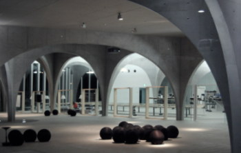
Images source: https://search.creativecommons.org/photos/d5046f2d-0e77-46a6-ac1a-c5ea7f4423d1
Info source: https://mahno.com.ua/en/blog/post/toyoito
- Serpentine Gallery Pavilion, London, United Kingdom (2002)
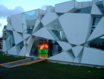
Images source: https://en.wikipedia.org/wiki/Serpentine_Galleries#/media/File:Serpentine_Pavillion_2002.jpg
- Sendai Mediatheque, Japan (2001)
On the outside, the building resembles a large glass aquarium, where instead of fish there are libraries, cinema, studio and exhibition space stand. Algae grow through the floors in the form of asymmetrical tube. Being unpredictable, they change direction, increase and decrease in diameter.
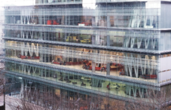
Images source: https://search.creativecommons.org/photos/5f4a0576-bbb8-4c22-91f4-5aecf9fb8cf5
Info source: https://mahno.com.ua/en/blog/post/toyoito
- White U, Tokyo, Japan (1976)
The design for the house began as an L-shape, with Ito’s sister expressing a desire for a visual connection between different parts of the house. However, as the discussion progressed the design began to focus increasingly on the symbolic nature of what the house meant to the grieving family. This lead to the introverted, U-shaped design which separated the domain of the family from the outside world.
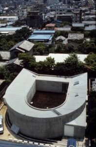
Images source: https://search.creativecommons.org/photos/702537f2-94d7-4c53-83b9-92e9b997d0ff by 準建築人手札網站 Forgemind ArchiMedia
The internal layout of the building consists of the long curved corridor, which terminates at each end in bedrooms: at one end the mother’s, at the other the daughters’. These ends of the corridor are dark, with the primary light source being the entrance to the internal courtyard, near the center of the bend – at the symbolic meeting point of the family. The surfaces inside are all white, creating a minimalist space for contemplative thought.
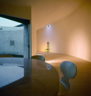
Images source: https://search.creativecommons.org/photos/ba0ad2ad-7b44-43c1-8214-d53a61f0d9fa by 準建築人手札網站 Forgemind ArchiMedia
Info sources: https://www.archdaily.com/345857/ad-classics-white-u-toyo-ito
Toyo Ito’s design
- Konoha, Sancal (2010)
Toyo Ito has been inspired by the double helix to design furniture that facilitates connection among people and that allows free use of spaces. The result is a bench with vegetal silhouette, similar to the fragments of a plant, with which we can compose a full leaf.

Images source: https://www.kezu.com.au/sancal-konoha-bench.html#
By combining the pieces of the series in different ways, we alter the rhythms. Changing the position or orientation of the benches, we can modify the context and adapt to the dimensions of any space. Toyo Ito uses natural, quality materials: wool, wood and steel to enhance the organic component of the design. Konoha is a Japanese word that means tree leaves. In a garden we find leaves, benches and sculptures all these, in one, is Konoha.

Images source: https://www.kezu.com.au/sancal-konoha-bench.html#
Info source: http://www.archiexpo.it/prod/sancal/product-50567-825716.html
- Mayuhana II, Yamagiwa (2009)
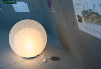
Produced by Japanese brand Yamagiwa, the Mayuhana lamp was first launched in 2007 and features a triple skin of delicate fibre mesh balls.
Images source: https://search.creativecommons.org/photos/c19ccdde-7dc0-4735-95ef-97b276ac0bee
Info source: https://www.dezeen.com/2016/03/03/mayuhana-lamp-toyo-ito-yamagiwa-even-darker-black/
- MU Cutlery set, Alessi (2006)
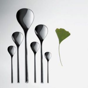
Mu, which means “hexagon” in Japanese, was designed to complement the Ku crockery collection he created for Alessi in 2006.Each piece of stainless steel cutlery has a slim handle that finishes in a hexagonal profile at the tip.
The range includes a fork, knife and spoon for the table, a fork, a knife and spoon for dessert, a pastry fork, a tea spoon, a coffee spoon and a mocha coffee spoon. Also available are salad servers, a ladle, a cake server and a serving spoon and fork.

Images source: https://www.designboom.com/design/toyo-ito-mu-cutlery-for-alessi-at-maison-et-objet/
Info source: https://www.dezeen.com/2013/01/17/mu-cutlery-by-toyo-ito-for-alessi/
- Senday, Horm (2005)
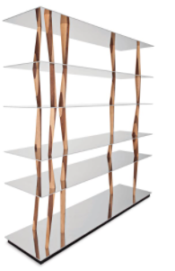
Movement and flexibility summarize the emotional power of Toyo Ito, who in this sculpture-bookcase captures the design essence of Sendai’s media centre (Japan), which he designed and used as inspiration. This leap in scale consists of six light shelves connected through turned elements of solid wood, all different from each other in inclination and section. Sendai is definitely a piece of furniture of silent albeit captivating design, which reflects the typical oriental philosophy of the great architect.
Images source:https://www.horm.it/en/mobili-design/sendai-libreria/
