Swiss Style, also called the International Typographic Style, is synonymous with crisp blocks, minimalist geometry, cleanliness, readability and objectivity.

Image source: https://www.printmag.com/post/swiss-style-principles-typefaces-designers By: Callie Budrick
First International Typographic style (1920s)
Despite its name, Swiss Style did not originate, nor bloom in Switzerland. Instead, its origin can be traces back to the 1920s when a small group of Swiss designers, having met with criticism in their homeland, scattered across Europe, in Russia, the Netherlands, and Germany. De Stijl, Russian Constructivism and Suprematism, Arts and Crafts and Jugendstijl were a part of Swiss Style’s pedigree.
The Style radically and progressively emerged in the wake of Modernism, the highly influential design and architecture philosophy focused on simplicity, functionality, and modern technology. It didn’t take long for the motto “form follows function,” first pioneered by the Bauhaus School, to become just as emblematic for the Style as well.
Before diving into its history, it is important that the ethos that shaped the Style, which was that design needed to be as invisible as possible. Designers suppressed all traces of subjectivity in their final product and stripped it bare of any added meanings or interpretations, as to let the content itself “speak” directly.
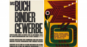
Image source: http://sarajacobsendesign.no/Swiss.html by Sara Jacobsen
Ernst Keller’s Philophosy
Ernst Keller believed that “the solution to the design problem should emerge from its content,” as he said during a lecture at the Kunstgewerbeschule Zürich, which is where he taught graphic design and typography in 1918. His approach to design was a reaction to contemporary, aesthetic-focused design that dictated beauty to exist for the sake of itself.
Keller answered with a style composed of simple shapes, vibrant colors, and meaningful imagery. Additionally, sans serif typeface became a fundamental design element, photography was often present more than illustrations, and mathematical grids were fundamental in graphic design projects. They believed that grids were the most legible, flexible mean of structuring and ordering information, allowing for the creation of modular, hierarchically structured and consistent output.
Keller was not the only pioneer in the genre. Max Bill and Otl Aicher, opened their own design school in Ulm and had some of the most decisive influences on Swiss graphic design. Most notably, their courses on semiotics, signs and symbols, emphasized objectivity and readability, which desired the same ease of understanding and recognition that the International Typographic Style strived for.
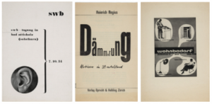
Image source: https://www.moma.org/artists/559
Developing the Swiss Style in the 1950s
Despite the movement’s strong affinity with contemporary design trends and currents, it took a few decades for its influence to to strongly resonate with contemporaries. Additionally, it still maintains a strong presence in design’s zeitgeist to this day.
At the heart of this rebirth, there were two Swiss designers, Josef Müller-Brockmann and Armin Hofmann, under Keller’s wing before World War II, who lead their own prestigious art school. Their institutions are the Kungstewerbeschule and the Allgemeine Gewerbeschule, respectively.
During these years, the movement gained immense traction, thanks to the renewed focus on typography and designing fonts. Firstly, the Univers family of sans serifs, emerged in 1954. Using the 1896 Akzidenz-Grotesk font as its basis, Univers became the first family type font – that is, a single font with multiple declinations – that allowed documents to use a single typeface, instead of several, which enabled an elegant, yet revolutionary uniformity.
Moreover, typography developed at this time followed a strict set of rules: always sans-serif, high quality printing, clear and refined lettering, and the capacity to adapt itself to any context or situation. Additionally, its expressiveness was unobtrusive and more of an instrument than a recognizable product. Once more, asymmetric layouts with text aligned flush-left and, most importantly, the use of grids to determine design placement, were the heart of this approach.

Image source: https://www.printmag.com/post/swiss-style-principles-typefaces-designers/
The movement began to become popular after the publication of “New Graphic Design,” a periodical which brought together influential figures of the International Typographic Style, began in 1959. As the publication was international, the ideas of the style spread throughout Europe. Also, photography and asymmetry became hallmarks associated with the style.
This worldwide appreciation strengthened after WWII, due to clarity, objectivity, lack of specific, nation-exclusive symbols that the design presented. In addition, the style resonated with various groups, including those in the United States. For example, designer Rudolph de Harak, whose famous book jacket designs displayed striking, thematic images coupled with asymmetric, grid aligned texts, initially adopted these principles in the 1960s.
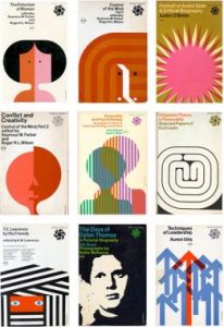
Image source: https://medium.com/fgd1-the-archive/mccraw-hill-paperbacks-rudolph-de-harak-ca0cf0d72ca5
Helvetica: An Ever-Presence
In 1957, these principles came to a head when Max Miedinger and Edouard Hoffman designed a pure typeface that maximized applicability and readability. Neue Haas Grotesk, better known today as Helvetica, references the Latin name for Switzerland.

Image source: https://www.smartsign.com/blog/short-history-new-york-city-signage/
In 1960, Helvetica quickly spread, thanks to its simplicity, rigor, and applicability in a wide range of contexts. Today, Helvetica is almost everywhere, adopted as the most popular font for signage and public manifestos. Web pages, logos, posters all utilize Helvetica so habitually that it blends into the background. What’s more, is the style reached beyond national borders, creating a legacy or a milestone in typography and graphic design that is a testament to the diverse acceptance of Swiss Style.
The Swiss Style Today
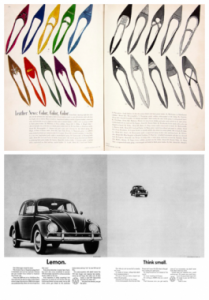
Image source: https://99designs.it/blog/design-history-movements/swiss-design/wqqqe
The Swiss Style fonts and tools are still abundant in web design, logo design, and typography today. One of its greatest contributions is the introduction of the grid. This tool acts as a framework for designers to convey information in a meaningful, organized structure. When the Swiss Style first developed it adopted a more rigid and coherent layout, organized like tabular data, which helped create equal spacing and a hierarchy within a page. These principles still form the basis for the creation of posters, books, and book covers, advertising, and signage. In addition, the style’s “less is more” approach, clear-cut figures, strong color schemes, contrasts, and bold typographic choices, continues to keep the style relevant.

Image source: https://pin.it/5X6hrm6
Swiss Style Designers
Spanning decades, the Swiss style has many famous protagonists, including:
Ernst Keller

Image source: https://commons.wikimedia.org/wiki/File:Ernst_keller_image3.jpg
https://commons.wikimedia.org/wiki/File:Ernst_keller_image.jpg
Keller, in many ways, is the father of Swiss design. In his role at the School of Applied Arts, in Zurich, he instructed many designers of the next generation, which mark the start of the grid systems for which Swiss Style is known. Additionally, his belief that design adapt to content, focused on the importance of typefaces. Further, his preference for striking graphics, irregular layouts and sans serif fonts, inspired the style and are now key elements in the movement.
Josef Müller-Brockmann

by Josef Müller-Brockmann

Image source: https://www.flickr.com/photos/20745656@N00/4516395897
https://www.flickr.com/photos/20745656@N00/4492390970
Müller-Brockmann, one of Keller’s pupils, pioneered Swiss Design in the 1950s, and developed the famed grid system. Today, he is highly praised for his posters, which combine text, photographs, and simple graphics to great effect.
Armin Hofmann

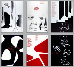
Image source:
http://typblographie.blogspot.com/2017/02/armin-hofmann-swiss-design-visionary.html
Armin Hofmann, along with Emil Ruder founded the Schule für Gestaltung. Hoffman distinguished himself for his unorthodox, peculiar teachings, such as his distinctive approach that played with heavy contrasts and weighted typography. After he accepted a position at Yale during the 1950s, he brought the Swiss Style to the United States.
Adrian Frutiger

Image source: https://medium.com/@cclaire/cdf-assignment-3-type-specimen-poster-univers-374501b7208d
Often called the pioneer of font design, Adrian Frutiger, worked on the Univers trend of font families. The trend preferred variations in a single typeface and allowed for versatility. Moreover, his work paved the way for many typographic works to come. The first of which was Helvetica.
Info sources:
https://99designs.it/blog/design-history-movements/swiss-design/
https://www.printmag.com/post/swiss-style-principles-typefaces-designers
https://journal.projectnord.com/blog/everything-you-need-to-know-about-the-swiss-style-xbPHo
https://99designs.it/blog/creative-inspiration/famous-logos-made-with-helvetica/
https://en.wikipedia.org/wiki/International_Typographic_Style
https://www.smashingmagazine.com/2009/07/lessons-from-swiss-style-graphic-design/
