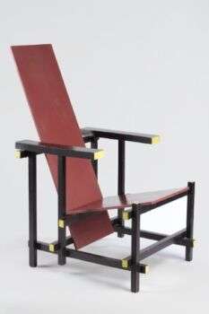
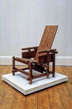
Gerrit Rietveld designed the Red and Blue Chair in 1918, and it is the first exploration by the De Stijl art movement in three dimensions.

Image source: https://search.creativecommons.org/photos/f8ec4976-ea4a-4ccf-8699-0c9bca4af6d6 by DocinhoLelê
Serialized Artisanship
Through the Red and Blue Chair, Rietveld manipulated rectilinear volumes and examined the interaction of vertical and horizontal planes, which is similar to most of his architecture. The chair, designed in 1918, has a palette scheme of primary colors, plus black, closely associated with the De Stijl group. Additionally, associated with the movement’s most famous theorist and practitioner Piet Mondrian. Intending for his furniture to be mass-produced rather than handcrafted, Rietveld aimed for simplicity in construction. Further, this is present in the very pieces of wood that comprise the Red and Blue Chair, which are standard lumber sizes readily available at the time.

Image source: https://search.creativecommons.org/photos/3fa24286-e8b1-4ad7-8677-539eca86c7b9 by Cea.
The Museum of Modern Art, which is home to the chair since gifted from Philip Johnson, states that the red, blue and yellow colors were added around 1923.
Rietveld’s Philosophy
Rietveld and his colleagues in the De Stijl art and architecture movement sought to create a utopia based on a harmonic human-made order, which they believed could renew Europe after the devastating turmoil of World War I. Thus, new forms, in their view, were essential to this rebuilding. Therefore, the chair, with its orthogonal lines and weightless, almost flat volumes, aimed to evoke this very minimalist, quasi-ascetic balance.
The chair, despite being previously created in unrelated circumstances, ended up as a companion piece to Rietveld’s other famous creation: the Schröder House (1925). Placed at its center, almost like a heart, the chair complements the house’s lines through its spacial freedom, sleek geometries, colors, and intersections. Further, their union reflect the desires of the De Stijl style.

Image source: https://search.creativecommons.org/photos/0f99552f-4080-4314-a588-320b08508f88 by Gerrit Th. Rietveld
Chair Construction
The Red and Blue Chair consists of straight boards and battens and a seat lacquered blue with a back red. In addition, the cut surfaces of the frame battens are yellow, while the rest of the battens are black. Further, the effect of this color scheme made the chair appear to almost disappear against the black walls and floor of the Schröder House (1924). Moreover, the areas of color look as if they float, and give it an almost transparent structure.
Rietveld seems to have viewed his chair as a work of art since he called it a “spatial creation.” He designated it a sculpture in space, rather than a piece of furniture. Further, the famous chair displayed at the journal De Stijl, also was in a show mounted by the Bauhaus, where it made quite an impact.

Image source: https://search.creativecommons.org/photos/b6b4e9d5-7dc9-413b-8195-435dc776cc1c by neil cummings
Info sources:
www.gerrit-thomas-rietveld.com
For more references, please also visit: www.jbdesign.it/idesignpro
